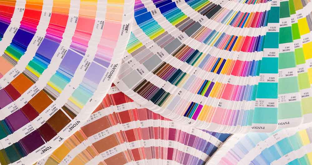
After a tumultuous year, it’s not surprising that colour trends for 2021 reflect positivity, combined with calmness.
The emphasis is on feeling uplifted but not overwhelmed. Perhaps because everyone has had enough of computer screens, the mood has shifted away from high tech bold schemes to more soothing colour combinations that reflect nature.
A positive palette
First and foremost, we’re looking for good news. There are a host of new paint shades in mulberry tones, corals, pinks and oranges to emphasis this desire for better times.
Rather than overtly bold reds, the vibe is gentler with a palette of more subdued pink and red shades that still offer brightness and positivity. Harmonised with creams and off whites, the effect is fresh and spring-like.
Natural combinations of colour
As well as gentler reds and pinks bringing a touch of spring to décor trends, natural browns and greens are also doing their bit to make it seem like a new dawn is on the way.
After a year dominated by screens, it’s unsurprising that we want to look at nature-inspired colours and curves rather than technology-inspired monotones and straight lines.
Green is everywhere right now, and that’s probably because it’s the most calming of all colours. The palette of popular green shades encompasses soft misty greens, neutral grey-greens and bolder olive greens.
Alongside greens, warm neutrals such as mushroom and milky almond are also being used to create cocoon-like, calming spaces.
Grey never goes away
The word is that green is the new grey. But grey never goes away. It’s perennially popular, from light hazy greys through to industrial concrete grey.
Grey could be considered a bleak colour, but it can become uplifting and comforting in the right combination. There’s something solid and reliable about grey that obviously appeals to people right now.
Faded and well used
Maybe the current appeal of grey is down to the fact that is has the familiar feel of something that’s been worn for a long time.
2021 colour schemes are definitely showing a recurring theme of muted, almost faded tones. These include watery, marine shades of blue, and indigo with hints of faded denim.
Navy is another shade that has a reassuring timeless appeal and is increasingly being used as an accent colour, harmonising with whites and yellows.
A hint of nostalgia
Even old-fashioned combinations are making a comeback, possibly because of the feelings of nostalgia they evoke.
Beige and orange and blue and yellow combinations that work well together and offer a retro look. Yellow is a colour that is constantly in and out of fashion. Current muted yellow tones are perfect if you want to create that ‘faded over the years’ look.
Golden yellow tones can be used to accent a predominantly pale green colour scheme while burnt orange (a colour that’s loved by some and hated by others) offers a stunning contrast in a design that uses brighter greens.
Would you like to transform your environment?
2021 is a year of hope and expectation for all of us. By refreshing your décor, you can embrace this new positivity and boost your morale.
Our painting and decorating team has years of experience and can help to create a fresh new environment that’s perfect for you. We can provide guidance and advice on choosing the right paint finish, wallcovering or digital mural for you.
We offer high-end painting and decorating in London and the surrounding area. Call us on 07899 777215 or email: This email address is being protected from spambots. You need JavaScript enabled to view it.

